


INKISH.TV proudly presents: Fons Put · Senior Innovation Consultant · VIGC · Belgium
At the Argos inspiration Days 2018 Senior Innovation Consultant Fons Put share his in-depth knowledge about colors and finishing.
Okay. Good afternoon, everybody. If you heard the talk with my colleague, Didier, very good speaker. We work on the same company VIGC, and you will find me there in the color lab experimenting with color layers, finishing. Everything that has to do with color.
I think most of you are students, design students.And, today I’m going to try to do it sort of small talk about technology and color. How is finishing affecting color? You see all these nice equipment to put layer on top of printed paper. What is the effect on printed colors? It is important for example if you are talking about brand colors, Coca-Cola red. Then, it’s important that you have a predication. Okay, after my finishing stage, I will have a Coca-Cola red, yes?
Maybe to make it a little bit practical, can I ask questions of the audience? Is that okay to ask questions? If you had samples, collected sample with finishing products, you didn’t? You didn’t? Okay.
If you look at the bag I collected, you have some finished products. And, my question to you is how is finishing? …For example, this gloss finished layers, how is a finishing layer affecting colors?
I wish I had more examples. Sorry. See if I can find more. I have not. What do you think when you see a glossy finished material? What is your impression when you look at it?
Pretty.
Pretty, yes. It’s a luxury feeling that you get because you know that comes? That you’re thinking it’s luxury?
It’s just a little bit sideways, huh? But, you think a glossy finish is a symbol for luxury because it’s connected in your brain. Ten thousand years ago, the presence of water, shiny things, that was a necessary thing in order to survive. The detection of water, and that’s why you think a glossy item is, I need it, it attracts me. Just an aside, nothing to do with this presentation.
You see, just to introduce a little bit discussion, you have a lot of products today on the market that use a certain type of finishing. As future designers, I think you have to be aware of this and try to work to use it. Not only the color but the finishing step that’s coming on top of it. And, you know, how the [inaudible 00:03:11] worker handles this? Especially, for my colleague [inaudible 00:03:12]. Sorry.
Okay, I see some examples. Maybe some figures. If you look at all printed material in the world, can you call me a number, a percentage? How may of the printed material that is finished? Just some numbers. What do you think in the back? [inaudible 00:03:41] Just make a guess.
30, 30%. What do you guys think? How many? 50? [inaudible 00:04:00]. These are the numbers I could find. 30%. 30% of offset printed colors today are enhanced by finishing, but important a customer is willing to pay extra money for it.
So, if you have a luxury book for example a photo book, you’re willing to pay more money if it’s nicely finished with a nice layer on top. And, also, important what do we expect for the future? People expect growth. 40% growth is expected. It will done more and more just as a market. That is the sample conclusion of this slide.
Okay, when you go to the IDC internet, we have a research [inaudible 00:04:55] app, and every year we invite a student to do a sort of research work on the specific top. And, two years ago, we did one with a student to research the effect of finishing layers, glossy, matte layers on printed color. And, that’s a little bit I’m going to talk about what are the conclusions of this research.
Color. I found that a lot of color you can find here on the [inaudible 00:05:28]. You told me when you look at samples, “Okay, give me a nice look and feel.” My question for this research was okay, that’s a good feeling but how can we transform this into numbers and engineering these things? How can we predict? I’m going to finish this print work with this type of coating, okay. I will predict what it does to my color. That was a little bit the goal of this.
So, how do you start? How do you transform this effect? What would do you do? If you say, “Okay, I want to know what my finishing layer does to my colors.” What would you do to handle this? How do you start? Any ideas how to do this? You probably all know light booth. Light booth like the picture here; often see it in printing plans, yeah. They’re used to elevate printing work, okay. Is my print okay? I’m going to the light booth and make an illustration.
That’s a good starting point because that’s equipment on the market, standardized, people are using it. Brand owners are using it. And, that’s a good starting point to elevate print and finishing. When you put layer enters the light booth, I see a lot of mistakes there. How do you do that? Have you ever used a light booth? May I ask? Any of you used a light booth? How do you look at a print in the light booth? It’s not a simple question. How do you? If you do it correctly, it should do it like this. You should place your print flat because the light source enters on top. And, you always have to have geometry, call it 45-0 degrees. That is a standardized geometry how to look at a print. You have a light source coming in, and you have to look at a 45 degrees. That angle is very important. That’s a standardized angle for evaluating color and finishing. That’s the starting point. We have a light booth. You going to use a specific geometry to look at the print.
When we look at a print on this light booth, see in the graph, there are two effects taking place. When you have a finished product like this one, if I take one of these, I’m in the spotlight here. If I slowly turn it, can you describe what is happening?
You see what’s happening? At a certain moment, you only see the spotlight, but not the print anymore. And, that’s the set up. That’s why this 45-0 degrees set up exists. This light source on top and hold this on the 45 degree to your eye. And, that’s the set up.
If you take another angle, you can end up … Can you use this … You have the gloss light that is a reflection of the light source. That has nothing to do with this printed. You see the light, and if you look at the top at the red particles, that’s your color light that gives the information of the color that you detecting, “Oh, I see red. I see green and blue.” That’s the geometry.
These are simulations. At the left, it’s printed color. At the right, is the finished color when I put the finishing layer on top. What’s your conclusion when you look at this? It’s just a simulation. What would you conclude about this? What do you think? Can you conclude something? If you look at the different colors? Yes? Can you speak a little bit louder?
It’s darker? Very important conclusion, and it’s not for all colors the same. That’s not the conclusion. If I look at yellow, I think it’s difficult to see difference, not easy. If I look at red, it’s very easy to see the difference between the finished and not finished color. Because you see some effects taking place, certain colors it’s almost invisible, the effect of the finishing. For other colors, it’s a rather heavy change in color. Black is also a different color. Can you notice the black? Of course, it’s a simulation. For black, it’s very important to have a finish. Strong effect in black. Okay. We’ll see why.
What is happening when these effects are taking place? If you look … If you go for finishing, in most packaging companies, you have finishing based on the glossy finish, luxury … A matte finish. Those are the two effects. And, what are they to do? With that glossy finish, then you have that mirror effect. The light is distracted, and you get your black turns deeper. You get more color information. If you would measure for example a mirror, what color would you measure from a mirror? Can you make a guess? Just set a mirror, and you would make a color measurement on the mirror, what color would you measure from the mirror? You don’t know? Can you make a guess? Do you think you would measure? The color of the mirror. Make a guess. No color is blank. You say blank?
Any suggestions? What would you measure on the mirror? What do you think? You would measure black? Yeah, you would measure black. And, why is that? Because the mirror reflects 90% of the light, and when you look on top, you see nothing anymore. Black. And that’s the effect of the matte and the gloss finish. Glossier the finish, the more the mirror effect and the colors are going deep. Light is distracted, and few pigments, color pigment getting deep. A matte finish is doing the opposite, it’s trying not to be glossy and distract lights in all directions, and you get not a deep black, but rather gray black. That’s the two effects that are taking place here.
Because, what is happening of course, these are observations. When we try to quantify them, we use color measurement equipment. Color [inaudible 00:12:41] photo meter to measure the color of print work. You see now a line of different colors on top and on the bottom. The finished product. What is all the effect on the different colors with glossy finish? The numbers that are you see below are the calculated color differences. The visual color differences as numbers. And, then you see the effects on different colors. If you look at the black, I see there 4.6. That’s a heavy deviation. That means that your black has turned a lot blacker by a glossy finish. And, look at the yellow, 1.1. That’s a rather small deviation; not too heavy, not a lot of difference. But, you see the red, 4.5. The glossy finish has a profound effect on red colors.
So, you can see the different type of colors. The pastel colors not too many, but to the color group has only a different influence on this. Okay, we know what’s happening. We can quantify it. We can measure it. Calculate it. When you go in detail, it’s maybe a little too detailed, but you see the different colors of the strip, the color strip that you saw. And, you see the color difference divided into three categories. That’s on the top left is it becoming darker, yes or no? See for black you are going down a little heavily. For yellow, you don’t. You say on top. The second scheme is the saturation of the color becomes a color more powerful. That you see the effect of different colors, and red popping out. Is becoming much heavier. And, the lowest graph is the change in color. Is my red becoming more reddish or less reddish? And you see also red is a different color. That’s becoming shifting in another color. Maybe a magenta, a magenta red to heavily red, not a tint. That’s some difficult for these finishing effects.
If you look at different types of finishing, I’ve tested the glossy, the super glossy, the matte finish, the satin finish. And, you see on the X axis is the increase in power and color power. And, what you can notice is the triangles. The green triangles is the satin ones. The satin finish is almost staying on the lower numbers. If you want to have a neutral finishing, go for the satin. That won’t affect your colors. If you go for very glossy finish, the more glossy, the more the change on your colors will appear. You have different kinds of finishing, different effects that you can divide the finishing types and the effects of colors. Quantify them, yes.
Okay, how to predict if we know we are … I am a supplier of coating materials. If I do a test of my material, and I extract numbers out of it, I can make tools for designers, for you to predict the effect of a finishing. I extract my … Calculating color profiles, I can predict what will be the effect of my finish. I did a test with now a picture, no picture. You see, it’s divided in two. At the right, is the picture before the finish. The left after the finish. You see it can be rather extreme effect, and you can if you want to do a very good print job, you can compensate for this finishing effects. You can print a print that is maybe not looking good before finishing but is looking perfectly after finishing. That’s the tools that you can use and practice as a designer to make artwork that is predictable after finishing not before, but after the finishing step.
Okay, let’s go on. Because we have the color effect and the glossy effect we see on this materials. How can you quantify them? It’s only … When you go for a gloss measurement, you have some typical instrument on the left, [inaudible 00:17:37] measurement. What it does is sending out light and it’s collecting light. It’s not anymore the 0-45 degree set up, but mostly it’s the 75 degree set up because you have to angle in out, 75 degrees. Meaning, you’re not [inaudible 00:17:57] what is the color of something, but you want to see how much light is reflecting on my surface. Have a look. If I take this again, choose an angle where you get the much light back from the light source. That number will give me the information. Okay, this the quality of my glossy finish. It’s 70. It’s 80. It’s 90. If it’s 100, it would be a mirror. It would reflect everything.
When we tested some different products in the market, varnish product and lacquer. You know the difference between varnish and lacquer? It’s a difficult thing. For me, I explain varnish is on the printing press. It’s like ink, ink without pigment. And, you can apply a layer of varnish, also a glossy varnish, but you have a limit because it’s a printing press. You can put two microns of varnish on top, not more. A printing press is not made to apply 4 microns of finishing on top of something. When you go for a lacquer, it can be eight to ten microns because it’s a separate unit not like you see [inaudible 00:19:19]. And, you … This can apply much more volume, much more liquid on top of a print.
The graph is showing the increase in gloss for each type of finishing product. For varnish and lacquer products, and you see the highest graph is the super high gloss product from manufacturer. Okay, when you tested it, we can see okay, it’s right. It’s a super high gloss finish for this product. And, you see the first bar is going down. It is, of course, a matte varnish that it is just going the opposite way. I would want a less glossy effect of possible of doing down. Product that is going down.
Okay. Is color, gloss know how it works? Know how? Okay. What about production of these things? We have these different machines, and I’m in control. I’m the printer, and I want to control my equipment, my process. I want to know, am I applying the correct amount of coating on my print? That’s the question for me. I want to have the resources. This is my amount of coating. I’m going to put that much on my print work. I’m going to control my production. This how to do is what we try to do this. Can you measure how much coating you have put on your print? What do you think? Any measurements? Does the amount of coating you put on a print? How would you measure it?
That’s maybe a better question. How would you measure the amount of glossy finish you put on a print? How to do that? Any suggestions for this? How to do that? What would you measure? I just … Simple things. If you measure the color, has no effect. Has no effect. You see the graph shows … it’s flat. The X axis more and more [inaudible 00:21:23], but the effect in color is always the same. It’s not … You can’t do it by measuring the color, but if you measure the gloss, it’s a simulation. That’s good instrument to control the amount, the layer thickness of your coating layer in production. For example, if you’re applying a matte varnish or lacquer, and you see how the gloss is going down, and the axis is the measured thickness is the rate of the coating. You see, okay, the more you apply, the more matte it becomes. And, then, you can begin to optimize production things.
Okay, what is the price of my coating. How many … Which effect to do I want to be good for my customer? Okay, I’m going for this layer thickness for my coating. That’s an instrument you can use to control the thickness of your finishing layer. Measure the gloss of it. That’s a very good instrument.
When you compare varnish that is applied on the printing press with the separate finishing equipment you see over here. The thickness is the difference of course, and you see on the X axis is the thickness of the layer. The green spot is the margin thickness on the printing press. And, you see that you can reach a gloss level and know the number 30. You can run 30 points gloss. And, the two other spots, the blue and the red that are amounts of separate coating units. And, they go to three and a half microns, four and a half microns, a matchstick of layer and then the increase in gloss. That’s the difference between these two production methods.
Production questions. You heard maybe standardized printing ISO 12647-2 standardized printed color. Questions on the industry are what is these target colors that are standardized by ISO? Do we have to go for these colors after finishing or before finishing? All good question. What does a packaging company have to do? Follow the target colors, the standardized colors with or without finishing? My answer is always with finishing. The end product that should be applied and controlled through these conditions. Open question.
Control strip maybe that not important when you … In the printing environment, you want to control the colors and you have a control strip, but that is … Do I apply my finishing on the control strip? Yes or no? Different opinions. My advice, don’t. Keep it without the finishing control. That is much easier to do.
Problem solving to finish my session. The last element, problem solving. What can go wrong with finishing? What can go wrong? Some examples from the … We had in our lab. This is from printed package, a packaging printer who prints the same package for more than package for more than ten years, the same order. It’s a food packaging with a sort of gold effect on it and finished with a glossy finish on top, a very luxury product. Printed for ten years, and then he comes to us, I can’t print anymore. It’s not working anymore. He gets a lot of damage on the boxes with ink going off and not sellable anymore.
Okay, what is going wrong? He comes to us … Give my your product. What are you doing? And, we are trying to simulate this process in our lab. What we found out, is what they do is they print colorant on cardboard, ink layer. It’s after that ink layer, they apply a primer, a primer layer. And, the primer layer has a function just to be … Attract the unfinished layer that it works well. That it sticks well on the surface. That’s the primer like you … In decoration when you painting your wall. Primer has the same effect.
And, we just testing with the tape test, how good sticks everything to each other? For example, a tape test you see that three pieces of tape, and the middle you see means I put my tape on my print work and rub it off. What sticks on my tape. Simple test to see how good attached is ink attaching to my surface. And, you see already how different it can be, the right and the middle. The middle is blank. It sticks good on my surface. The right all the ink is on my tape. It’s not good adhesion to my … What was going wrong? Is when they did these test, we came to a difference in the primer layer.
The primer layer was a new product that they were starting to use. That has a very high adhesion power. Because what was happening, the weakest link in this print work became the end layer. If you apply mechanical force on the print, the first thing that cracks is the ink, and that’s a very bad situation. But, then you get the package with light spots where the ink removed, and that’s just because the primer was too heavy.
When we went back to his hold primer that wasn’t a structure … That did not … That was not that heavily attaching the glossy finish meaning if you apply a mechanical force on my package, the first thing that breaks is my top layer, my finishing layer. Meaning my ink is still on my surface, and I … There are no complaints about this. It’s just no [inaudible 00:28:02]. It’s a shift in, okay you see some … But it’s not that heavy as a white spot on my package. His problem was solved by using another primer to attach the glossy layer on the ink.
That’s our typical production problems that can … Maybe another one with packaging that are packages with metal ink. So, it’s shiny metal packaging with a finishing layer on top. Okay. Print it, and what happens? By transporting his print work, the whole batch was damaged. When you took a print sample again from this packaging, it was a lot of scratches on it. It was not sellable anymore because when he made some photographs with a microscope on it, we can have a very detailed look on how the surface is looking. And, you see on the left, that was his problem. When you use silver ink, the silver ink contains aluminum flakes to have that silver look. When your finishing layer is not thick enough, you get a moon, sort of moon surface with very scratchy elements in it. And, you transport that … Sheets … How do you say it? Are in contact with each other, you get damaged effects. Damaged effects. Scratches and dust. Our solution here was use a better finishing layer. Better quality. More thickness of the finishing layer. Problem solved.
Okay. Just to conclude, my conclusion for when you go for technical advice for applying finishing, first positive element is the market demands finishing. Volume, volume is increasing. And, customers are willing to pay. That’s a good situation. We have a look at the color effects. Color effects are clearly visible. Have glossy layers. And, you can predict them. If you are a designer, you want to have control. It’s possible. When you go for the gloss effect of the finishing layers, remember you have all these different types satin, gloss, high gloss, super high gloss. It’s all these different types, and it’s possible to quantify them by measurement. To have some independent view on what is the quality of this material. It’s possible by measurement. And, the last point, when you are in the total chain of standardize printing and finishing, the printing company has to make some choices from what they are do to control the process. So, that’s the end of my talk. If there are questions, please ask. If not, I hope I brought some information to you. Thank you.


No Data Found.
Content for this section will appear here once available
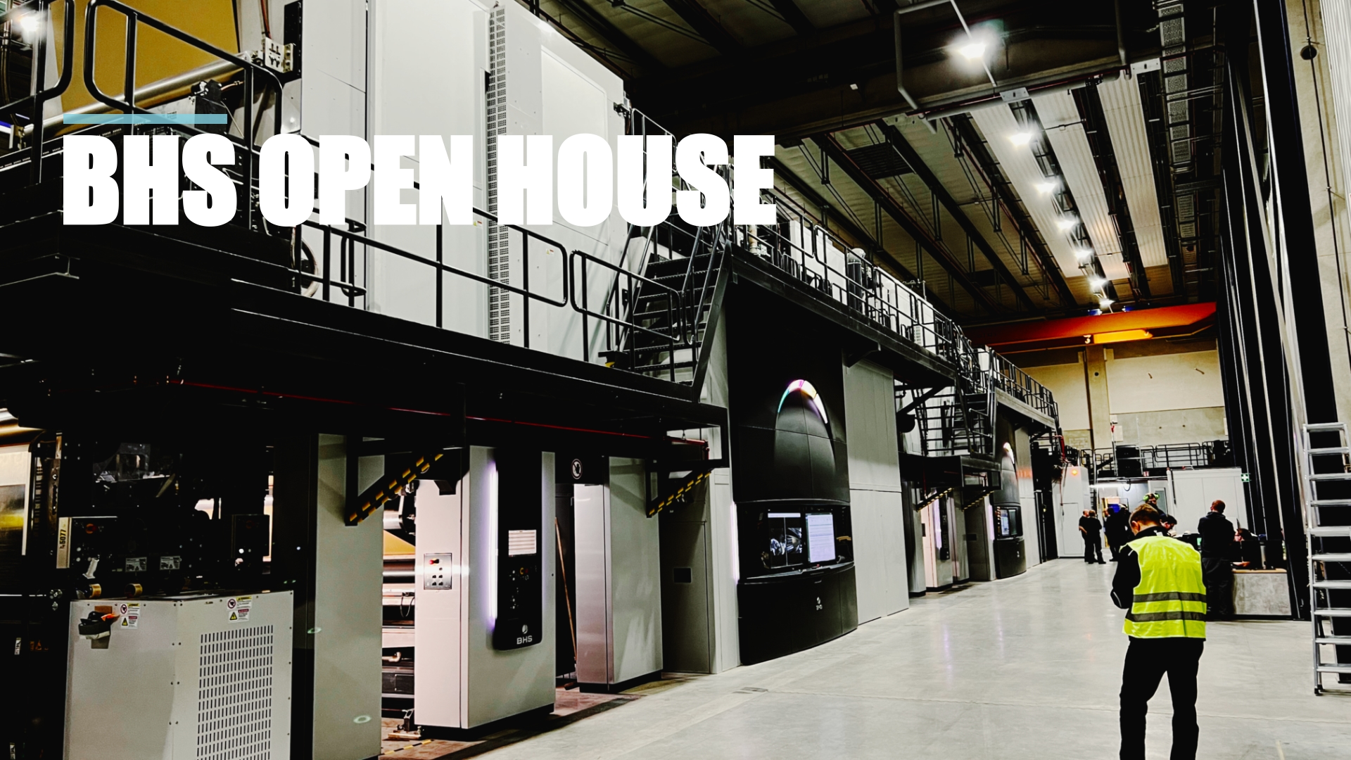
Mon April 1st

Increased Productivity using CERM and ESKO ·...
Increased productivity is extremely important - and yes, CERM and ESKO play an enormous role with the Sicialian label producer Auroflex. Still, the business is developed around a quality and passion for supporting the Sicilian wine, food, and luxury products industry. But Auroflex does many things that are a bit out of the standard, for example, an annual design competition, where designers are invited to challenge Auroflex - and all the designs are produced to show what's possible - and as Fabio Butera tells INKISH, this develops a close relationship between Auroflex and the designers, that eventually will make some of the most complex and interesting design. Auroflex produces labels in both flexo, digital, and offset. The most important reason for investment in print technology is from Nilpeter - an offset/flexo hybrid machine - by all means, an amazing company, and see how CERM and ESKO are used in planning, pricing, color management, and, of course, inspection - in tightly integrated solutions - merging beauty with efficiency - love it.