


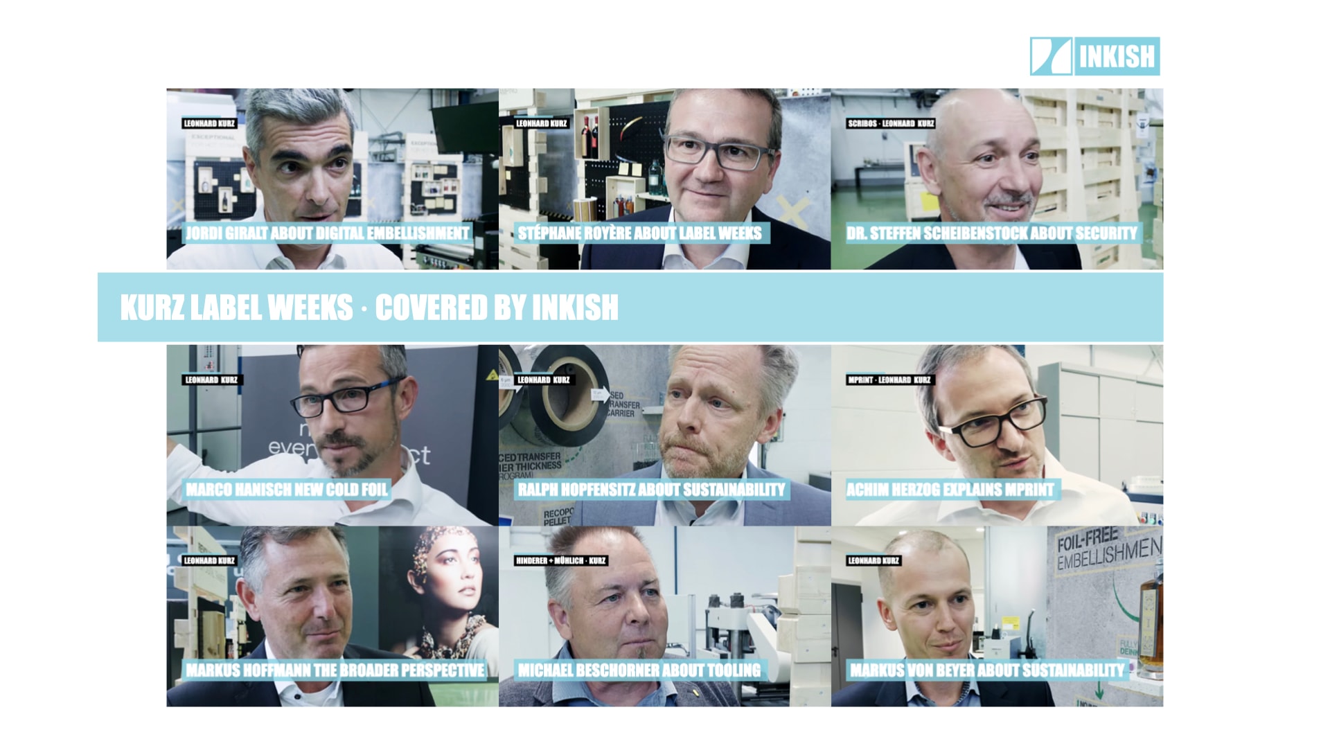


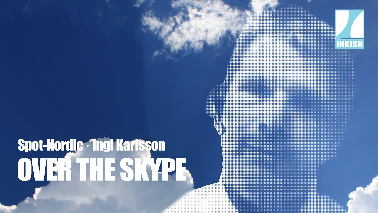
Ingi Karlsson – Over The Skype · Spot-Nordic
Ingi Karlsson used to operate printing presses, and back in 2003, he started thinking about how impossible it was to match colours across gamuts, substrates, and output devices. At that time he began developing the Spot Matching System, which essentially is a colour-bridge that guarantee even colours on coated and uncoated paper, as well as electronic devices, i.e. video, screens, etc. The idea is simple since SMS colours are defined about the combined gamut that RGB/CMYK can offer and therefore guarantee an even output when standards such a G7/Gracol/Fogra etc. is used.
Dedicated, I must admit – and yes, he is on to something, so take a look, and reach out for further information.
As with all our ‘Over the Skype’ interviews, quality is limited to bandwidth, web-cams, and ability to literally LIVE mix the conversations. However, it works, and with Over the Skype, we will bring you more than 20 exciting people, and angles on the industry as it is right now.
Enjoy!
Dear audience, this is Morten from Inkish TV and yeah, we are getting around the world. I have been talking to people in India, and Friday, I’m talking to people from San Diego. Today, I have a stopover on Iceland and I’m talking to my good friend, Ingi Karlsson. So welcome to my channel Ingi. How are you today?
I am pretty good. Thank you so much.
I got to know you from LinkedIn like so many other people get to know each other from these channels. I have been following you for some time because you have a specific interest in colors, which we’re going to talk about in a moment. But before we do that, can you talk and tell us a little bit about who you are and what you do in Iceland?
Yeah, of course. Well, my background is I am an offset printer. I’ve worked as an offset printer for 20 years or so. My special interest during my career as an offset printer was basically in mixing colors. I was fortunate enough to find the right niche for myself. I was always interested in colors, Pantone colors mostly, so that’s where I specialized. Basically, towards the end of my… Well, around 2000, I came across a certain problem with my beloved Pantone colors which I of course like very much to this day. But the problem is simply that today we have 90% CMYK jobs and maybe like 10% Pantone jobs. And the problem is…
I think a lot of printers can recognize what you’re talking about because I think that more and more is going to.
Yeah, yeah, I’m sure.
And every time a new printer is a… Especially digital printer is introduced, they always talk about a broader gamut because they want to cover as many Pantones as possible. Right? So I guess that you are totally right in that perspective.
Yeah. Yeah. But as I said, even if we have extended gamut today, we have seven color. Yes, the technology is there, but still 90% of the printing presses are still CMYK. We are still stuck with CMYK for newspapers, for magazines, et cetera. And even for, well, letterheads and whatever you need, your office materials.
The problem I came across is that you cannot print Pantone colors properly in CMYK. It’s not easy. Another issue or problem that I… Well, I at least felt it was a problem. Well, the same Pantone color doesn’t print the same on coated and uncoated paper. So being a bit of a perfectionist as a printer at least, this annoyed me because my view on color is that if you are a customer and you pick out a color, it should be my job as a professional to keep your color visually consistent whether you’re printing on coated or uncoated paper.
Just a short question before we move on. Wasn’t that the intention when Pantone introduced the Pantone Plus that you don’t have the same formula necessarily for coated and uncoated paper, but you wanted to have a closer visual impression of the Pantone representation?
I believe if you look at your… Do you have a recent Pantone guide?
I have it in my office, but I am stuck home because of corona. So sorry.
Yeah. I believe the recipes are still the same for uncoated and coated. It is possible that they made some alterations to the color bridge, the CMYK guides of Pantone where they tried to adapt basically both coated and uncoated to… I think the idea was to try to adapt it better to the RTP value of that Pantone color. But I’m not quite sure actually. You know, I may be wrong.
That’s okay. But I was just wondering because since you experienced what you just said about colors not looking the same on coated and uncoated paper, that was one of the reasons why you got into developing a system that actually is able to be reproduced similar on both coated and uncoated stock.
And just before we go into the details about that system, just please continue with your story because working as an offset printer and moving into color I think that your company also in Iceland is also specialized in colors and color management and ICC profiles and things like that. Is that true?
Yeah, yeah. Exactly. That’s what it’s all about.
Yeah. So that is how you got into also speculating about solutions for the problem that you have identified?
Yeah. Yeah. Also, well, this is one part. This is just the way the Pantone Matching System is built. It was fine back in 1960 if you’d just… The idea was simply that a printer in New York could print the same color on the same paper as the printer in Dusseldorf for instance, you know?
Yeah.
That was the idea and it worked. In our times, we have a completely different world. This is the world of multiple media. You have the internet. Let’s just take printing and just hold the internet for a while, you know?
Yeah.
Around 2000, when everybody started printing in CMYK, all of a sudden it was cheaper to print a CMYK job than, for instance, a two color Pantone job.
Yeah. Which was not the case when you had two color machines of course. But with a faster setup times better plates, better screening methods-
Yeah. And full color presses.
… and full color presses. Of course, that changed a lot. Yeah. Yeah.
Exactly. It changed the game overnight, basically around… Yeah. I think it was around 2000 on a worldwide basis. But what unfortunately happened at the same time when designers switch from printing Pantone colors because it was cheaper to print in CMYK, it seems the world just forgot to think about what happens to a Pantone color when you convert it automatically to CMYK, and it seems that nobody cared except maybe… Well, I did because I was seeing this in my own press room. But the precious Pantone brand colors were just being screwed up.
Flattened out. Yeah.
Yeah. Flattened out, and they were completely different than CMYK.
I think that what you’re talking about is also the fact that even some of the modern or the younger generations of designers as well, they use only electronic designs today. They use of Photoshop and Illustrator and InDesign and use maybe even the RGB palette for even creating print jobs. So what I take that you’re saying is basically also that all the entire color space is under some kind of pressure because how do you recognize and identify? Because if you have Pantone color of whatever X, the 021 for orange for example, then you don’t have a similar system for CMYK values. Was that some of the reasons for also inventing SMS?
Well, that was not the idea when I started working on the SMS system. Actually, you may not believe this but I started working on this system in 2003.
Okay. That’s a long time. Yeah.
So it has been quite a long time with some stops, I admit, you know?
Yeah.
But back then I was simply involved in this. I wanted to create a new color pallette for designers which… Well, number one, it was supposed to… Well, you should be able to print the same color on coated and uncoated paper. So visually, we want the same color on coated paper and uncoated paper, these basic two types of paper that you usually use. Well, that was number one, two and three actually. Then of course, there was the method back then. I was thinking about, it should be possible to print in CMYK or as a spot color. So you should be able to pick your SMS color and print it in CMYK or as a spot color.
Okay. So there was a match also at that time with the PMS color. So you could pick like… So basically, you said that instead of adapting the PMS color space, you basically said that, okay, we have this number of PMS colors, Pantone colors that matches the SMS colors. Right?
Actually, I was not thinking about basically matching to Pantone, you know.
Okay. But I thought you said that the Pantone colors was part of the SMS system when you started it. So I was just wondering if you want it, because I think that because now we started talking about the SMS system anyway, and I was just thinking that may be for people to understand what we’re talking about. Basically, SMS is similar like the swatch book that you know from the Pantone colors. But what you have done is you have, I don’t know if you’ve tested it or it’s scientifically proven, but you have made a swatch book that basically show… Is it 144 colors or how many colors is it?
500.
Oh, sorry. Forgot that. 500 colors that you warrant that they work on the substrates that they are printed on in both coated and uncoated paper. Right?
Yeah. Exactly. Yeah, yeah.
So it’s a tool for designers. So instead of picking a Pantone color, if they pick a SMS color, they can get the same representation every time they produce something that is printed in CMYK.
Yeah. On coated paper and on uncoated paper, but which is quite important today because of course we have social media, we have the web, we have video. You can also actually reproduce all SMS colors for any display. So basically, I can send you any SMS color. I can send it to your smartphone and you can actually evaluate it on your smartphone.
Okay. So just to understand that, so let’s just recap a little bit. So basically, you identified the problem being a printer yourself that it was sometimes impossible to get accurate representation of PMS colors in your CMYK press. And then you started working a long time ago on actually finding out what colors could be reproduced on both coated and uncoated stock.
Yeah. Yeah. Exactly.
And now also taking that to the extent of what’s possible to reproduce electronically. You know, 500 colors is a lot, but it’s still not a very high number compared to the number of Pantone colors. I don’t question that 500 shouldn’t be enough, but I’m just more wondering if you look at the SMS colors, is that basically, if you take the entire color gamut and you basically say that, okay, this is the FOGRA color space for a CMYK machine and this is the color space for the RGB, and then you’re basically take that complimentary set of colors and then you define the colors from that complimentary selection you… or how does it work?
Yeah. Basically, I take those colors that are common among all those color spaces. SRTP. SRTP is for displays.
Of course, yeah.
Any display. Yeah, the FOGRA. FOGRA51 and FOGRA52, FOGRA39. and FOGRA47 and actually GRACol as well for my American friends if they need it. I find out which colors are common among those color spaces. I pick out those colors and I create my color palette. That’s it, basically. Yeah.
Okay. If we look at it from a… Let’s say that the customers that you target, is that basically the designers and the people that create the prepress jobs or who is the primary target group for this product?
Well, the final, the main, and the most important target group for this system are of course the brand owners themselves. It’s brand owners like you for instance. You have a company and you have your logo. Most companies have their own logos and even the smallest of companies, they can afford to pay 420 euros per year to have all their colors up to four colors of your logo completely managed, and that is what is included in our service.
So yeah, it’s the brand owners that our essential goal. But of course, it is important to note that designers of course have to adapt to SMS and start using it because if they refuse to use it, it is difficult to get to the brand owners of course.
Of course. I’m not a designer, but from a designer’s perspective, especially if you have new customers and you have a design, a new logos, it should be pretty easy to adapt to it because it works the same way as when you are picking a Pantone color. You just pick another list of colors basically. Right?
Yeah. But it is actually much easier because if you pick a Pantone color then you know, and if you say, okay, this is going to be the brand color for this customer, customer X, let’s say.
I like it. That’s fine.
Yeah. Then you have to basically… Typically, what designers do today, which is of course completely wrong technically if you think about it. Usually, a customer will pick a Pantone coated color or colors first and they will show this to the customer. The customer agrees because they are nice colors, right?
Then the customer basically goes and he looks up the CMYK value from the color bridge guide of Pantone, the coated version, and they pick out the CMYK value and they will hang this onto each… So each Pantone color has a fixed CMYK value stuck to it basically. The red one, the yellow one and the green one for instance. This basically means that… Well, the CMYK colors for each color, they will not look the same as the original Pantone color.
That’s for sure. Yeah.
We know that from the start. If they change from coated to uncoated paper…
They will change even more.
Yeah. Yeah. Than other variation, you know.
Yeah.
But if you pick SMS colors instead, they will always look exactly the same. And every time you have a new job, you simply need to call Spot-Nordic, tell me what you need, what you’re going to do. I’m going to print on this type of paper. The printer prints to this standard or I can actually just contact the printer for you and get the information I need and I provide you with exactly the correct variation for this job, for this printer. So you as a designer, you can just focus on design, you don’t have to worry about the final result of the color.
Yeah. So just to summarize on my question about customers. So that is a brand owners and designers who are the primary target because I believe that… I mean if you are a printer and you have like adapting to ISO standards or G7 standards, then you don’t need to do anything. Right? It’s more questioned that it has a match from the designer according to those standards that you’re using. Right?
Yeah. Yeah. A common reason for problems in print is that the designers don’t know the print standard of the printer. It is unbelievably typical scenario whether you believe it or not. You know, it may be different in Denmark. I don’t know.
I don’t know yet. No.
But I hear this all the time. So basically, what we do at Spot-Nordic, I talk to the designer and I talk to the printer. I know the standard of the printer and I can communicate this information to the designer. Because believe it or not, sometimes in many cases the printer is a little bit afraid to talk to the advertising agency because they are concerned if they ask too many questions that the agency may go somewhere else. They may get annoyed, which is of course in 99% of all cases completely wrong. Usually, the agency is happy if the printer calls.
Yeah. Because basically they want to ensure that everything they do from a brand consistency perspective is uniform throughout all the process. I think that you also know Michael Apelco from DMX in Denmark, right?
Michael? Sorry, can you repeat?
Apelco. Abildgaard. Yeah. Okay. I thought we spoke about it earlier because he is teaching on a DMX in Denmark and I attended a presentation he did for the Norwegian Printing Association. I think it was about two years ago where he presented.
Uh-huh (affirmative). I got the name, Abildgaard.
Yeah, precisely.
Abildgaard. Okay.
Yeah, yeah, yeah. Because I think he took some examples of very well recognized brands and measured the Delta Es in how a fantastic widespread of color consistency they used even for brands like Starbucks and Coca-Cola and some of the really, really big brands. I think that’s also because you touched a little bit upon it, that if you have SRTP that’s for screens and you have CMYK for print, but you even have the different standards within the color science as well that you need to apply to.
So when you do a design manual today, if you use PMS colors, if you use the color metrics for the designers you need to specify also what color space you are working in. And that is also something that you don’t need when you use the SMS colors, right?
Yeah, exactly. Exactly. If you use the SMS colors, you simply… You only need to basically… Well, your brand standard is simply you need to tell the world basically which SMS colors you are using. You don’t need to mention standards. You don’t need to mention even different media. You can simply say SMS number. It may be a standard SMS color, it may be a custom SMS color because of course we are not completely set on using only these 500 colors. We can add-
Yeah. Because since you have the complimentary group of colors in the gamut, you can basically pick anything inside that group. So when you’re decided on 500, that is because that is visually giving a widespread of colors and at the same time it relates to families that I think will compliment each other, right?
Yeah, exactly. Exactly. So we can tweak SMS colors and as a designer you can even create your own SMS gradients if you like to use gradients in your work, you know?
Yeah.
So no problem. But yeah, the brand manual will be simplified a lot if you use SMS colors and you can even show your print manual in SRTP on any display. So you can just send it and you can see it for yourself.
Yeah. So the brand owners and the customers will either be able to see something that you don’t even have to make a proof print off because you were basically ensuring that this RGB output is the same as the paper output.
Exactly. Exactly.
Ingi, you’ve been working with this for a long time and I know that you are extremely active promoting the SMS things which I like. I think that’s a very great drive you have on this one. But what is the future for alternative color spaces and how is it… I mean do you work with distributors or you work with partners or how do you get the message across to a bigger audience?
Well, I am basically, today, Spot-Nordic, which is my company, open to basically almost anything, you know? I’m open for companies to resell within their countries. Yeah. Anything is up for discussion. I would definitely like to sell SMS in, basically, all countries of the world. And so yeah, if there’s a distributor out there or a reseller who would like to sell SMS, by all means, give me a call.
So I think that was a good ending of a nice conversation, I believe, because now everybody who is seeing this, you have an opportunity to make life easier for your customers when it comes to color and identity. And it seems that Ingi Karlsson from Spot-Nordic, Spot-Nordic has done a lot of the work in advance, so I think that you should reach out to him. The contact details are here within the… Just on the page of Inkish. So reach out to him and I know that he will be happy to give you further information. So thank you very much, Ingi.
Thank you. Bye-bye.


Contact
Spot-Nordic / Spot Matching System
111 Reykjavík
Iceland
Email : sms@spot-nordic.com
Mon April 1st
Increased Productivity using CERM and ESKO ·...
Increased productivity is extremely important - and yes, CERM and ESKO play an enormous role with the Sicialian label producer Auroflex. Still, the business is developed around a quality and passion for supporting the Sicilian wine, food, and luxury products industry. But Auroflex does many things that are a bit out of the standard, for example, an annual design competition, where designers are invited to challenge Auroflex - and all the designs are produced to show what's possible - and as Fabio Butera tells INKISH, this develops a close relationship between Auroflex and the designers, that eventually will make some of the most complex and interesting design. Auroflex produces labels in both flexo, digital, and offset. The most important reason for investment in print technology is from Nilpeter - an offset/flexo hybrid machine - by all means, an amazing company, and see how CERM and ESKO are used in planning, pricing, color management, and, of course, inspection - in tightly integrated solutions - merging beauty with efficiency - love it.