


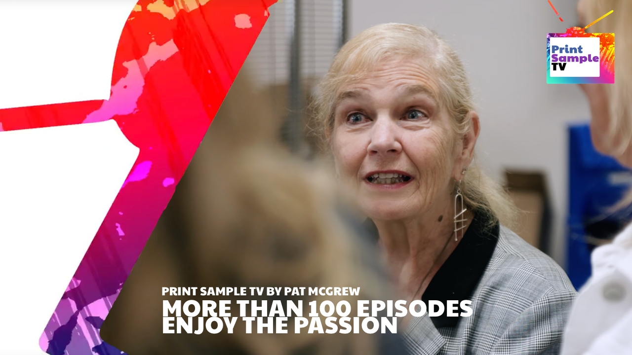


Print Sample TV By Pat McGrew · Metallic Ink that Shines · Xerox Iridesse
This time Pat McGrew got her hands on a cool sample produced on the latest Xerox digital press – the Xerox Iridesse. In this episode of Print Sample TV Pat McGrew talk about the possibilities Metallic Ink gives and how great it looks. Many vendors offer metallic toner/inks, but with the Iridesse it seems that a new level of ‘true-to-physics’ look, are achieved. Looks really cool, but see for yourself and enjoy Print Sample TV.
Pat McGrew appears courtesy of Keypoint Intelligence
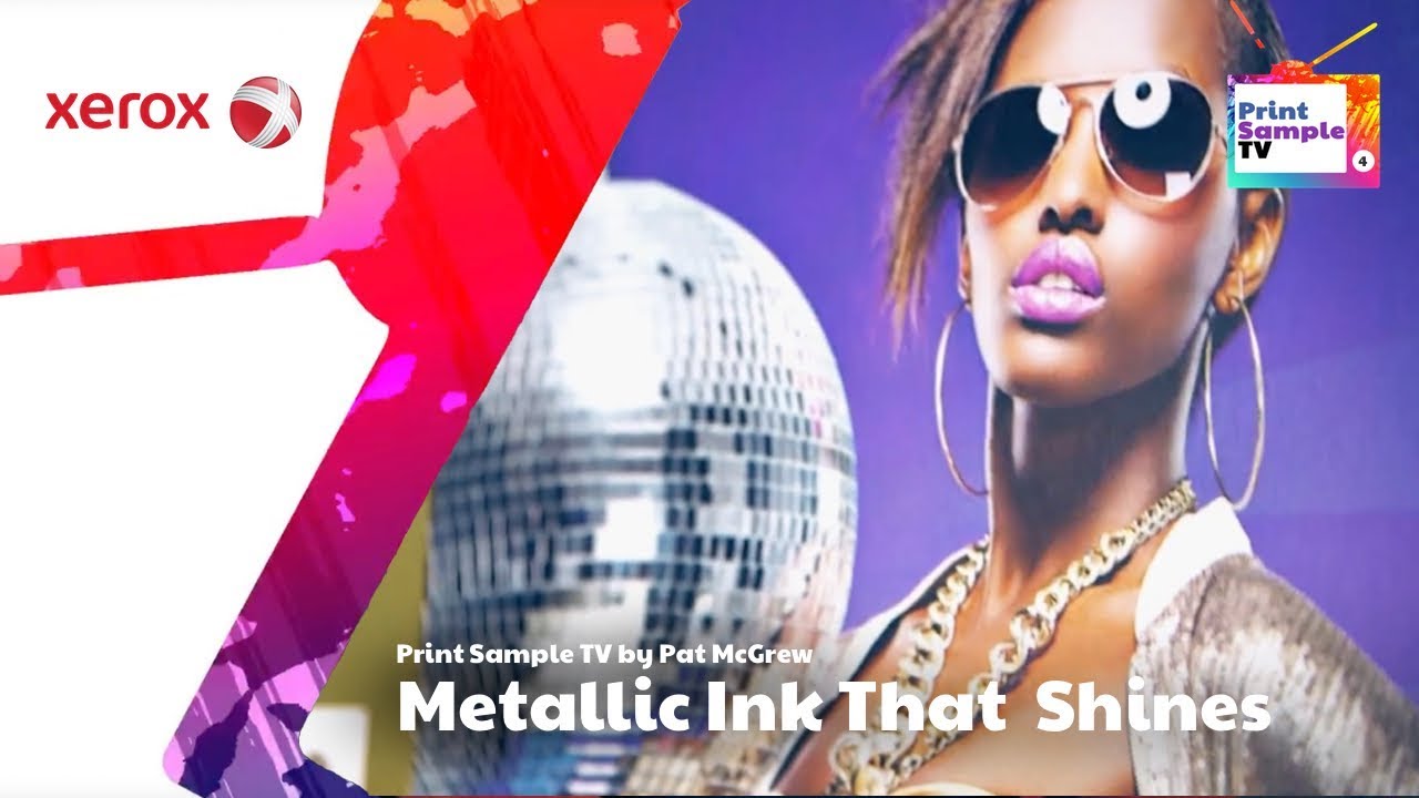
Hi, I’m Pat McGrew, and welcome back to another edition of Print Sample TV. Today our snippets are brought to you by Xerox. We recently had a chance to see a demonstration at the Xerox Iridesse, and if you haven’t seen the technology, it’s really quite interesting. It allows a printer to add a lot of metallic and clear effects to the things that they print.
So I have a sent of print samples here that I think they did a very nice job with. If you take a look at this one, it’s usually very hard to show metallic on cloth. Actually it’s hard to show metallic on anything, and so they’ve done a nice job of really highlighting the rose metallic shoes that are part of the this ad. They did the same thing by showing the glitteriness of the disco ball here. And again, normally when we see these things printed, even on glossy stock, they can be very flat looking, and the Iridesse gives you an opportunity to really make those things pop.
They didn’t stop there. They actually took the time to create a couple of other pieces that I thought were really quite fascinating. So this is actually a series of bird postcards, and each one of them features a rather geometric bird, but if you look at them really carefully, you’ll see that they’re really quite well highlighted. So all of the silver that you’re seeing here is actually a silver metallic ink, which really makes it pop much more than a light or a dark gray might for these birds, and it just gives a nice luxurious feel.
So if you think about luxury packaging or luxury direct mail, those are the kinds of things that would really make a difference, that this metallic would really make a difference for.
The last set of samples they brought over to us are really quite interesting because they show a progression. So as you start to think about print samples, showing a progression to a value proposition is a really excellent thing to do, and very few print vendors do this. The folks at Xerox created a set of business cards. So business cards aren’t anything magic. We do them all the time. Printers do them every day on all sorts of stocks, all sorts of designs.
So they did their business cards, and it’s a very nice rich blue with a little bit of magenta in the background. The backs of the cards are just a flat magenta, but they didn’t stop there. They went the next step and for the second set, they actually showed, and it’s a little bit hard to see, but there are actually overcoats of a clear that highlight different geometric patterns on the business cards, just giving it a little bit of a luxury feel. But they didn’t even stop there.
Then they showed the full-on luxury adventure for business cards, and on this one they’ve really outdone themselves with what the Iridesse can do. It’s got a lot of metallic ink here. There’s a lot of patterning here. If you were trying to create print samples that can show your full range from pretty straightforward printing to just pure-on luxurious printing, this progression really does that. So for me, Xerox did exactly what I’d hope they do to really promote the power that the Iridesse brings to a printer.
So that’s one really great set. Good job Xerox. I’m Pat McGrew. This is Print Sample TV. We hope you’ll come back for another edition.


No Data Found.
Content for this section will appear here once available
Wed February 4th
Packaging from Shutterfly · Pat McGrew · ...
In this Print Sample TV episode - and can you believe it, already #103 - your one and only, Pat McGrew share her photobook purchasing experience from Shutterfly. It's about branding, but also getting your photobook delivered without weather conditions :-)